Justin Ramirez
Projects


Drawing I
i could of used a lot more dark and thick lines. i think i could have made the background a little darker because its hard to see the objects. i could of done more cast shadows for the objects. i did a great job on making the light reflections and showing where the light is coming from. the shading on the objects isn't the greatest but i tried. overall it's not my best work but its still good.

I should of zoomed in more and shaded more. but i think i did a good job on shading the cast shadows and could of down better on the background.but overall i did a decent good on the 6 points of light.
On my still life drawing i feel like i really got better at the 6 points of life especially on the bottle on the right. i feel like i could of done a better job on the cast shadows i feel like i made them all one tone.i could of made the figure in the background a little bit taller. i definitely improved on my tones i did a better job than on my 3 cups. next time i could add a little more detail or define more things better because on the cup to the left i felt like i really didn't define it really well. but overall i felt like it was a real improvement from my 3 cups drawing.
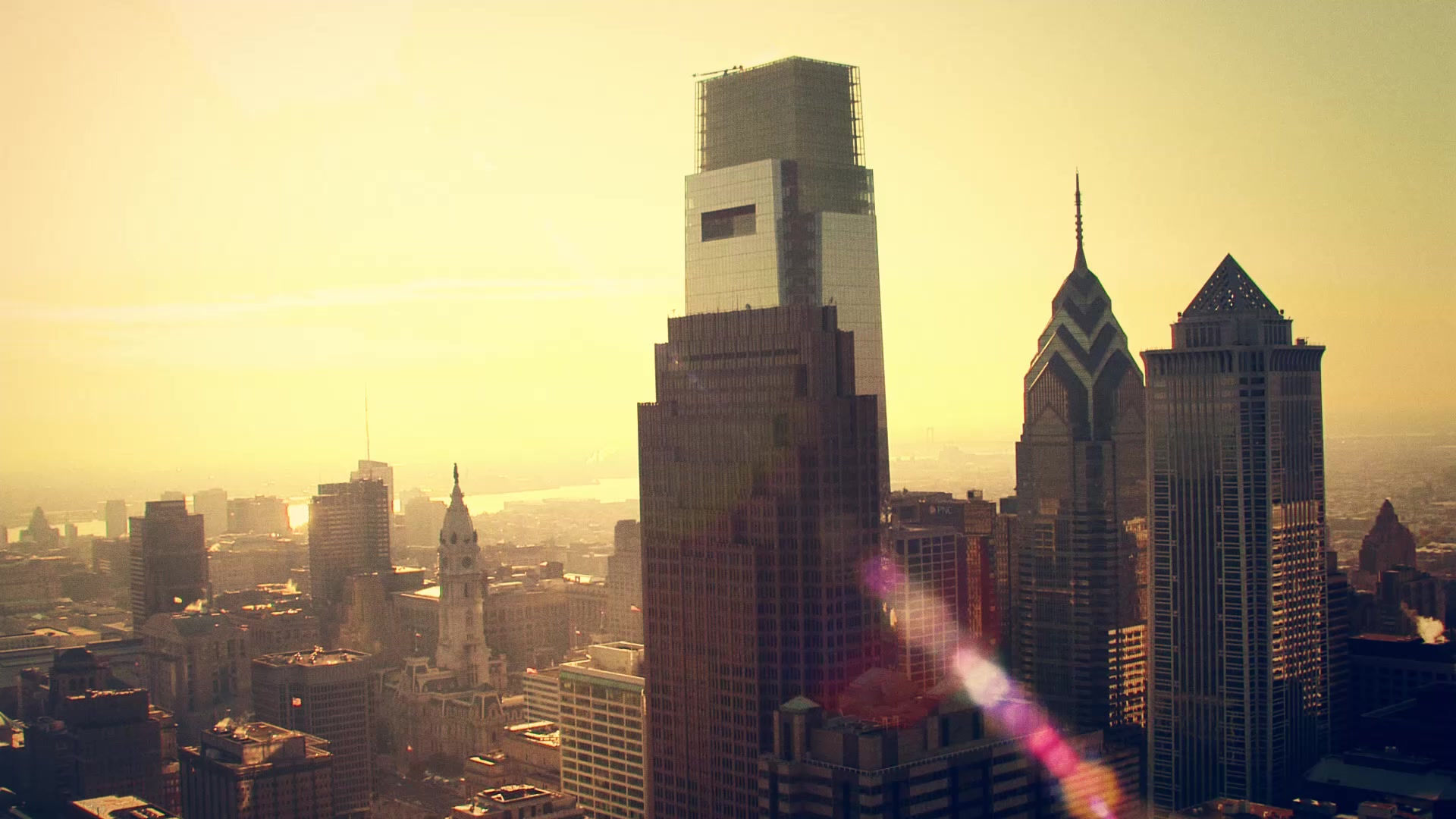
i picked a really good picture with a defined vanishing point. i could of used my time more wisely because on the right side it looks nice and uniform but the left side looks rushed and not quality work . but overall on the bridge has some great detail and has a range of tones. the whole picture has a nice range of shading. i like that i decided to make the background buildings just black because it breaks the picture up. i feel like the picture doesn't end like most pictures do because you can see the end but on mine you cant. that is what i think about my drawing.

i feel like i could of used more value in my picture but overall i think i got my porpotions correct except my nose i couldn't figure out the nose. i got kind of lazy with my background but in the end it made my person pop out more. a lot of people said it looked like me but i disagree completely. the glasses make my head look pinched but it didn't look like me with out the glasses. again i could of used more value range. im happy with how it turned out.
i used the 2 point perspective really well. i just need to put more values on it because its really light. i did a really nice job on the details of the bricks and arches. i really could of made my vertical lines more straight because it makes some of windows looked tilted. so really i just need to put more values on it. so thats my two point perspective.
my choice drawing went really well. I feel like I could of used the gray paper better. i used the black and white aspects better since my first charcoal drawing. i wish i could of found a better to blend in the gray so they don't stick out. the most difficult part was trying to get the hind legs to look right because you can only see a little bit. but i really think this is my best work yet.


